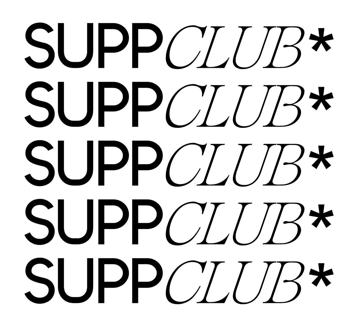
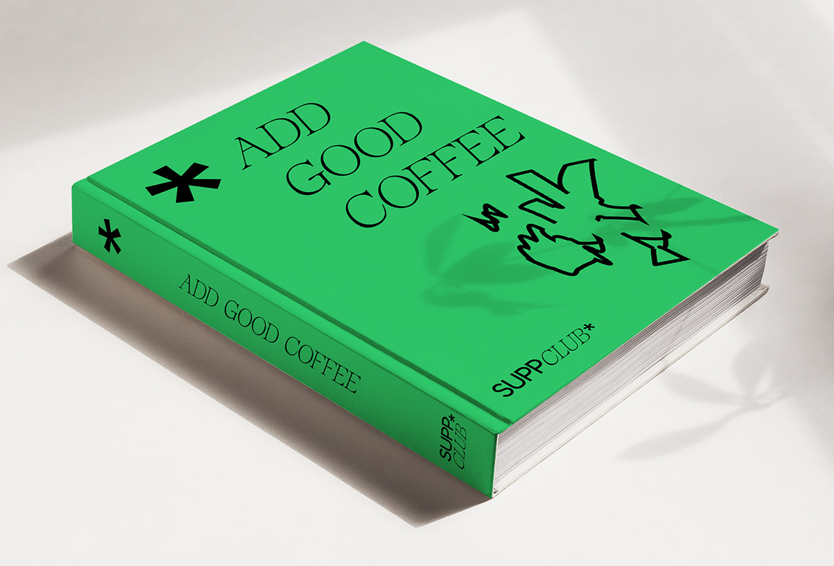
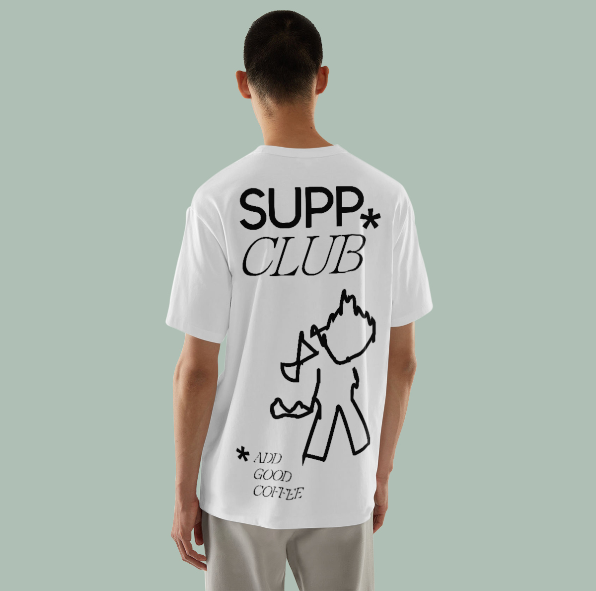
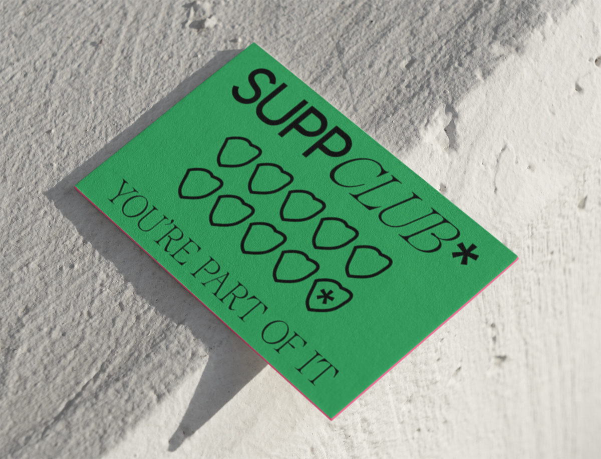
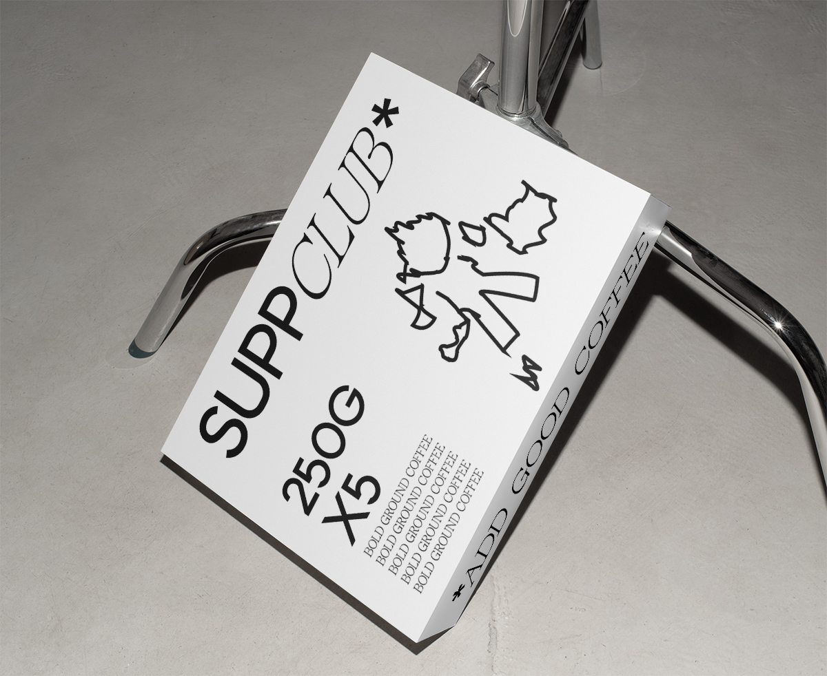
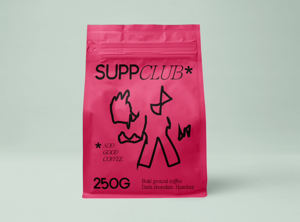
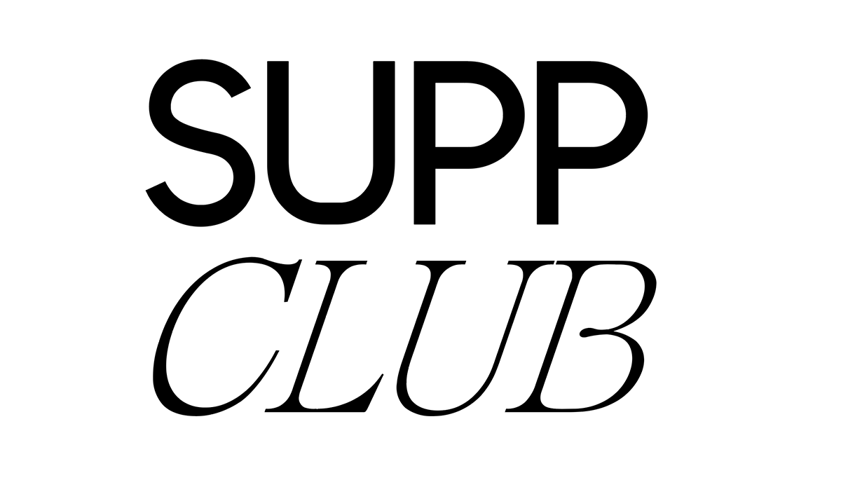
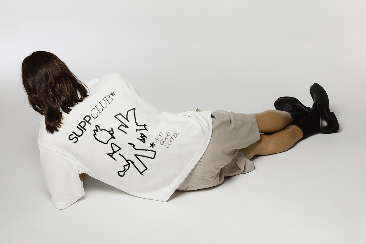
SUPP CLUB
Branding and illustrations for a coffee brand that’s full of personality. I wanted to bring life to this bold brand that speaks to coffee lovers everywhere. The packaging sits proudly on shelves with bold type setting and illustrations that are based on scribbles that customers may make whilst dreaming in coffee shops.
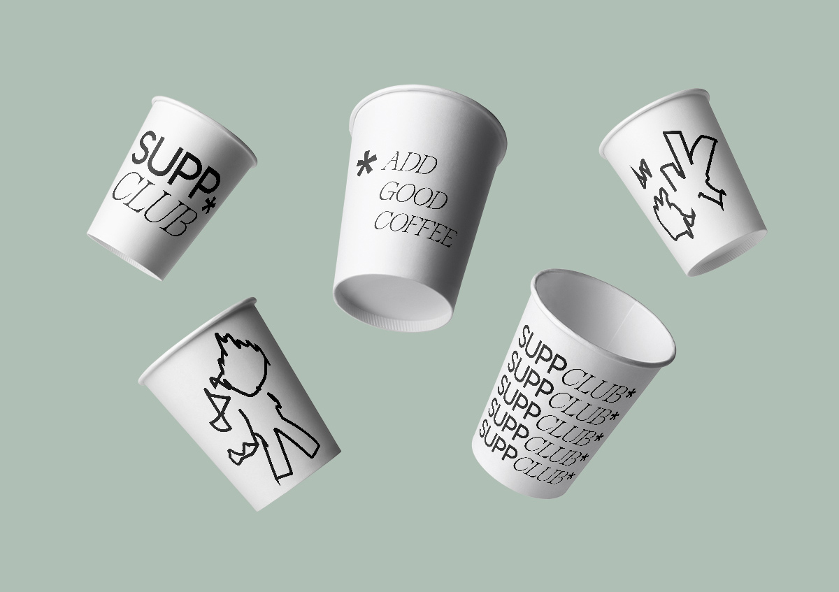
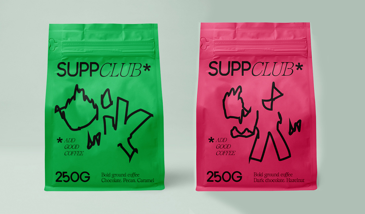
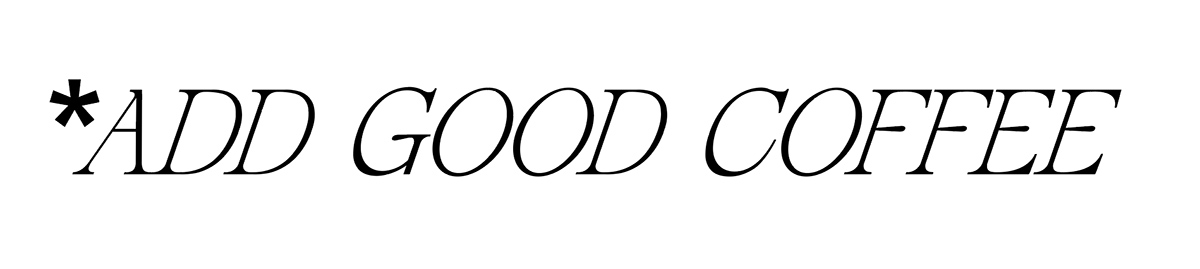
SUPP is taken from the word ‘supplementary’ referring to adding something i.e. coffee to complete or improve your day. The limited colour palette makes this brand feel bold and vibrant without complications. It’s straightforward and feels dynamic. No apologies here for simple messaging that shouts about good coffee.